
The Gutenberg Component Autocomplete is an interesting one. You can use it to show a list of posts to choose from or any other list possible. In this tutorial we are going to learn the options for it and how it is used inside of Gutenberg.
If you’re interested in a more advanced tutorial on this, you can watch one which I made using the Autocomplete.
https://www.youtube.com/watch?v=2wM6VyJ9Dp4
Do note that this was done on an older Gutenberg version so some of it might not work although I did test it out recently.
The Gutenberg Component Autocomplete can be found on their
Autocomplete Properties
Autocomplete Component accepts completers which are objects defining their usage.
completers– Array of completers,onReplace– Optional. A function that will be used if the used completer configuration has the propertygetOptionCompletionset and theactionis set toreplace,record– Used for context.
Do note record
I have overcome the issue by passing an record={{}}RichText
Completer Properties
There are several properties for each completer:
name– This is a lowercase name (unique keyword) for your Autocomplete component so it can be filtered,options– This is the core of this component. This can be an array of options, a regular function returning an array or even a function returning a promise (function returning a Fetch/AJAX),triggerPrefix– A string that will trigger such Autocomplete component. If you put@when writing, it will pull out WordPress users to choose from,getOptionLabel– This is a function that will return the label. It can be a string or even HTML (JSX) wrapping the option to choose from,getOptionKeywords– Optional. A function that will return keywords used for showing the options,isOptionDisabled– Optional. A function that will return if an option is disabled or not. The option is passed to the function,getOptionCompletion– A function that will define how the chosen option is shown. By default, it will show at the place where it was called, but it could be something else such as converting it into a new block. It should return an object withactionandvalue. Theactionis how this will be done,allowNode– Optional. Function will take a text node and it will return a boolean. Iftrue, then this Autocomplete will show,allowContext– Optional. A function that will take a range before and after the trigger. And it will use the text inside of that range for querying options,className– Optional. CSS class that will be applied to the popup menu that shows options,isDebounced– Optional. Boolean. Iftrue, it will delay the call for retrieving options. At the time of writing, it’s delayed for 250ms.
Using the Autocomplete
When writing a custom block using the Autocomplete, we should get it like this:
const { Autocomplete } = wp.components;Let’s get over the example provided on Github:
We have only one completer configuration here with the name of fruit. The prefix is ~ which means that when we type that, this completer will be called and we will see fruits to choose from.
The options property is a simple array of options. Because of the defined property getOptionKeywords like that, while typing it will show options that match using the name in the options property. The Grapes option will be disabled.
The options will be shown with an icon and the text because of the property getOptionLabel. When an option is selected, it will become an abbreviation using the property getOptionCompletion.
How Gutenberg uses the Autocomplete Component
As noted, 4.0.0 is causing errors using the Autocomplete component as above. Let’s see how Gutenberg uses it.
Gutenberg uses the Autocomplete Component only inside of the RichText component and here is how it is used in the render method.
So basically, due to this information, we should use the RichText editor component and pass the completers configuration. That should do it to work as expected.
When there are no defined completers, the default completers are used. Let’s see the default completers.
User Completer
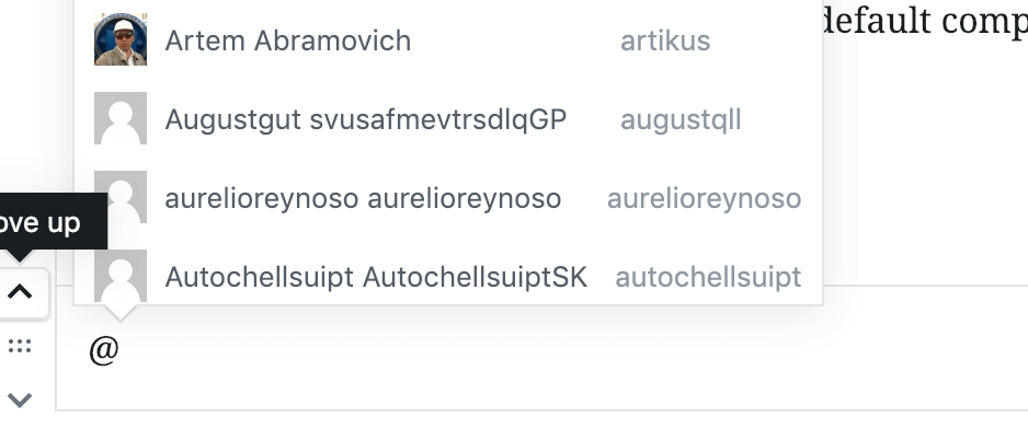
To trigger the Users completer, we will use @ and it will also debounce (delay for 250ms) in case we start typing more. That’s because we are fetching WordPress users so we don’t want to create calls to our database each time a character is written. If we type something and wait for a little, then it will fetch the users.
For each retrieved option, we will check against the user name and slug since that’s how the getOptionKeywords property is defined. We will also show all found options with an image, user name and slug due to getOptionLabel.
When we choose a user, it will be returned as @{user.slug}.
Block Completer
The Block Completer is a bit more complex so we won’t show all of the code. There are several function definitions. I would suggest you to take a look at it in your free time on the Github repository.
The most interesting part here is how they use the property getOptionCompletion to define the action as replace and the value is a function to create the actual block.
Conclusion
I think this component is really interesting and it may find a lot of usages in your custom blocks. This can be used to choose from a list of posts, different custom post types or something entirely different.
Have you already used it elsewhere? Share with us in the comments below on how you implement it and for what you use it.
Become a Sponsor


Share this: