Gutenberg Component BaseControl is a component you won’t be seeing too much but it is one of the core components used in a lot of elements that you’ll use when creating your own Gutenberg blocks.
You can find this component at https://github.com/WordPress/gutenberg/tree/master/packages/components/src/base-control
You can think of this component as a label in HTML.
BaseControl Properties
The properties of a BaseControl Gutenberg Component are:
id– This is a string with thesame idthat the element will be (input, select and such). When using labels, we woulduse for, label– If we put text inside of this, it will create a label element,help– If we put text inside of this, it will create a help text under the controlclassName– If provided, it will add that classalongside components-base-control, children– This is the content to be displayed. In JSX, that’s the wrapped content.

The Drop Cap Toggle Control uses the BaseControl Gutenberg Component. The wording “Drop Cap” is the label property. The wording “Toggle to show a large initial letter” is the help property.
Using the BaseControl
When writing a custom block, you would need to import BaseControl like this:
const { BaseControl } = wp.components;Here is an example on how the TextareaControl uses it:
This control accepts both label and help properties and then it passes them to the BaseControl Gutenberg Component.
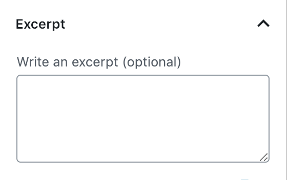
To get an even better sense on how this is used, here is how the Excerpt part uses the TextareControl to provide a way for writing excerpts.
This will create only the label element inside of BaseControl since it is without the help property as seen in this image below.

Conclusion
BaseControl is a Gutenberg Component that might come in useful when creating all sorts of various custom form inputs and elements.
It is a component that most of us probably won’t be using too much, but it is good to know that such component is there so you don’t have to write labels yourself.
Become a Sponsor


Share this: